Brand Guidelines for Partners
Corporate Identity Guidelines
CONTENTS
Logo
The logo is the primary identifier of Peak. It is only used in black or white and must never be reproduced in any other color. Keep clear space around it equal to the cap height, and never go below 9 px height in digital or 3 mm in print.


1.1 Logo suite
The Peak logo is the primary logo and should be used in all standard applications. It is the preferred expression of the brand, allowing the Peak name to build strong recognition over time. The Peak + Tagline lock‑up is used when additional context is needed — this is the preferred choice over the “Peak Energy” logo, as it gives the Peak logo space to stand on its own while the caption communicates additional information.
The Peak Energy logo is reserved for specific contexts where the Peak logo alone does not provide sufficient clarity about the company or its activities. It should only be used when explicitly required.
The primary logo — used most frequently, in all standard applications.
Used when additional context is needed. Distance to tagline = 1/4 of the logo height.
Reserved for contexts where Peak alone doesn’t provide sufficient clarity. Only when explicitly required.
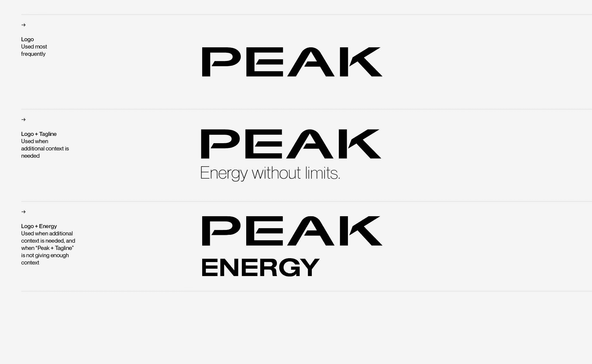
Logo suite — the primary Logo is used most frequently; Logo + Tagline when additional context is needed; Logo + Energy only when explicitly required.
1.2 Primary logo

The logo is the primary identifier of Peak. It is employed to quickly communicate our name and identity. It is a central element in our visual communication system.
The primary Peak wordmark — the preferred expression of the brand.
1.3 Logo clearspace

When placing other elements near the logo, use X as a metric for determining space allowance. X is equal to the cap height of the Peak logo.
Logo clearspace — use X as the space allowance metric, where X equals the cap height of the Peak logo.
1.4 Logo + tagline clearspace

When placing other elements near the logo and tagline, use X as a metric for determining space allowance. X is equal to the cap height of the Peak logo.
Logo + tagline clearspace — X equals the cap height of the Peak logo.
1.5 Logo + Energy clearspace
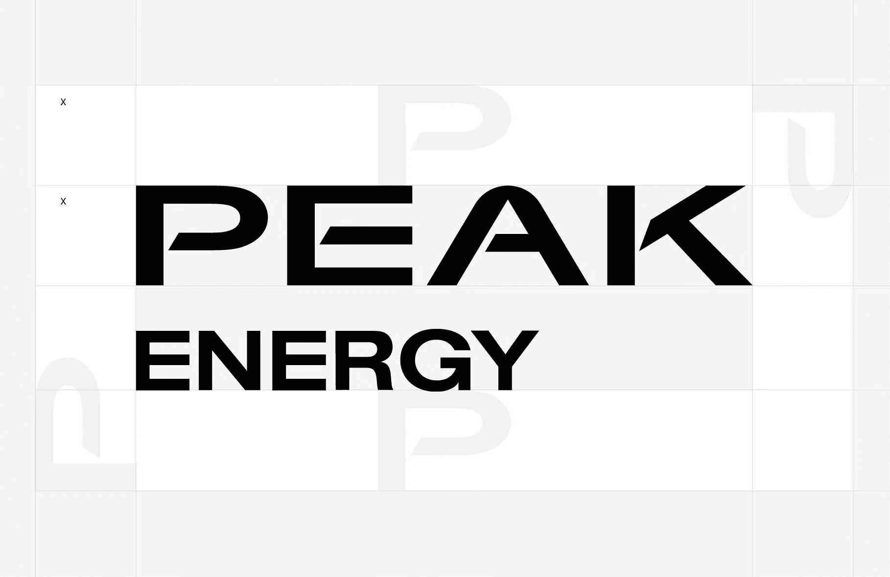
When placing other elements near the logo and the word ENERGY, use X as a metric for determining space allowance. X is equal to the height of the symbol.
Logo + Energy clearspace — X equals the height of the symbol.
1.6 Logo color usage
The logo should always be used with consistent, legible color across all applications. On light backgrounds use the black version. On darker backgrounds use the white version.
Always use the variant that provides the best visibility given the background color. The Peak logo is only used in black or white and must never be reproduced in any other color.

Color usage — black logo on white, white logo on black, black on gray, white on imagery. Always choose the variant with the best visibility.
1.7 Logo color
The Peak logo is only used in black or white and must never be reproduced in any other color.

Black
R0 G0 B0 · C0 M0 Y0 K100
#000000
White
R255 G255 B255 · C0 M0 Y0 K0
#FFFFFF
1.8 Scaling
The logo has been crafted to read well at all sizes. Avoid overly large use cases that cut off the logo, and always ensure the logo is easily read. Never go below 9 px height for the digital logo size and never crop the logo off.

Scaling — never crop the logo at large scales; 40 px is comfortably sized; never go below 9 px height in digital.
1.9 Scaling limitations
The minimum recommended height of the logo is 3 mm in height for print and 9 px for digital. Never reduce the logo below the minimum sizes specified to ensure legibility and brand recognition.
The logo has been carefully crafted to read well, even in small sizes. There is no limit at large scale, but be careful at smaller sizes.
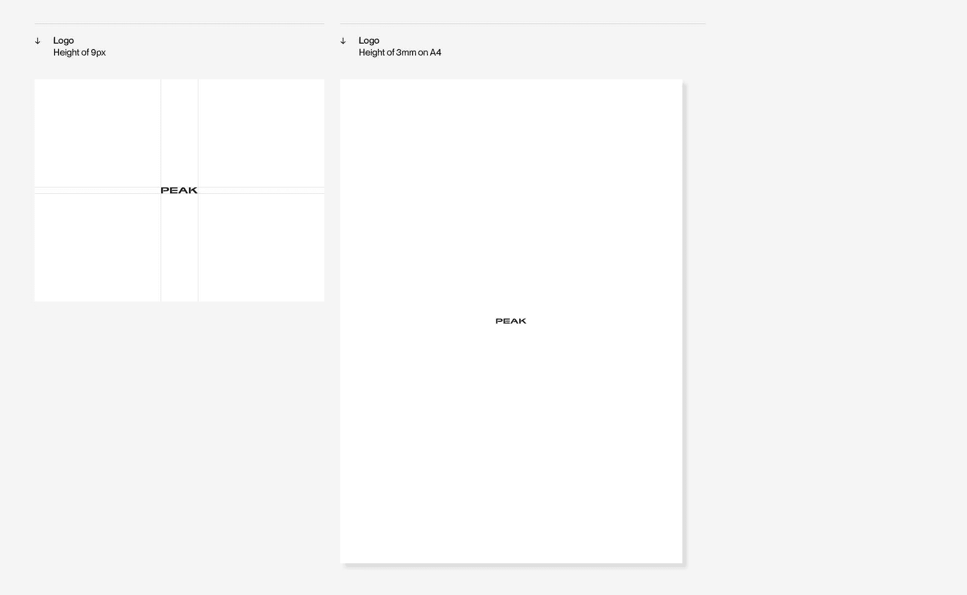
9 px — minimum digital height
3 mm on A4 — minimum print height
Shown at true scale. Never reduce the logo below these sizes.
Scaling limitations — minimum 9 px height for digital and 3 mm for print. There is no limit at large scale.
1.10 Scaling in composition
Always be sure the elements can be easily seen and understood. Do not crop identity elements. Always align the logo to the layout grid to ensure its size remains proportional to the format.

Scaling in composition — too small for the composition · scaled correctly · too large. Align the logo to the layout grid.
1.11 Logo placement
Our wordmark can appear in the corners or in the middle of the page. Just give it plenty of space and make sure it’s optically aligned.

Placement — the wordmark can appear in the corners or the middle of the page; give it plenty of space and align it optically.
1.12 Logo misuse
Do not diminish the value of our logo. It is important that the appearance of the logo remains consistent. The logo should not be misinterpreted, modified or added to.
No attempt should be made to alter the logo in any way. Its orientation and composition should remain as indicated in this document.

Misuse — don’t distort or warp, don’t outline, don’t add effects or drop shadows, don’t rotate, don’t change tone, tint, opacity or the type.
1.13 Logo & photography
When adding the Peak logo on top of photography, select images with lots of space and low visual noise.
If a busy photograph is important to the communication, use a layout that features the branding and typography in a separate location rather than on top of the photograph. Only use the white or black Peak primary logo on top of photography.

Logo & photography — black logo on bright photos, white on dark photos, corner placement respecting the safe area. Never place the logo on busy areas.
1.14 Co-branding
When the Peak logo appears next to a partner, sponsor or event logo, both logos carry the same visual weight: the partner logo takes up the same area as the Peak logo. Measure each logo by its bounding box — the tightest rectangle around the visible logo, without clear space.
Keep at least the clear space X between the logos (see 1.3 Logo clearspace) and align both logos on a common horizontal center line. Always use the original Peak logo files from Downloads.
Formula
Area = width × height of the bounding box. Partner logo area = Peak logo area.
Partner logo height = Peak logo height × √(r Peak ÷ r partner), with r = width ÷ height. The Peak logo has r ≈ 6.1.
Example: Peak logo 30 mm high (183 mm wide). Square partner logo (r = 1): 74 × 74 mm. Partner logo with r = 3: 128 × 43 mm.
→ Square partner logo · r = 1 · sizes in Peak logo heights

Peak · 6.1 × 1 = 6.1
Partner
Partner · 2.47 × 2.47 = 6.1
→ Wide partner logo · r = 3 · sizes in Peak logo heights
Peak · 6.1 × 1 = 6.1
Partner
Partner · 4.28 × 1.43 = 6.1
Co-branding — partner logo and Peak logo take up the same area, with at least clear space X between them.
Typography
Neue Montreal is our primary brand typeface — a modernist sans serif selected for its timelessness, simplicity and functionality. Always default to Neue Montreal. Peak uses four weights only: Light, Regular, Medium and Bold.
2.1 Primary typeface
The Neue Montreal type family is our primary brand typeface.It’s a modernist sans serif typeface, selected for its timelessness, simplicity and functionality. Neue Montreal provides clarity and contrast at smaller scales, making it the perfect functional typeface for us. Always default to Neue Montreal, to ensure you communicate easily with everyone.
Neue Montreal provides clarity and contrast at smaller scales, making it the perfect functional typeface for us. It is designed by Canadian type designer Mathieu Desjardins, founder of the type foundry Pangram Pangram. Neue Montreal is a licensed typeface — if you need it for your own work, please license it directly from Pangram Pangram.

Neue Montreal — uppercase, lowercase, figures and punctuation.
2.2 Hierarchy
There should always be clear hierarchy of type, establishing a relationship between different kinds of information and their relative importance. Ensure size differences between different kinds of information.
A variety of sizes and weights allows flexibility — but use it carefully and with purpose. Too much and the design feels messy and unconsidered; keep variations to a minimum.
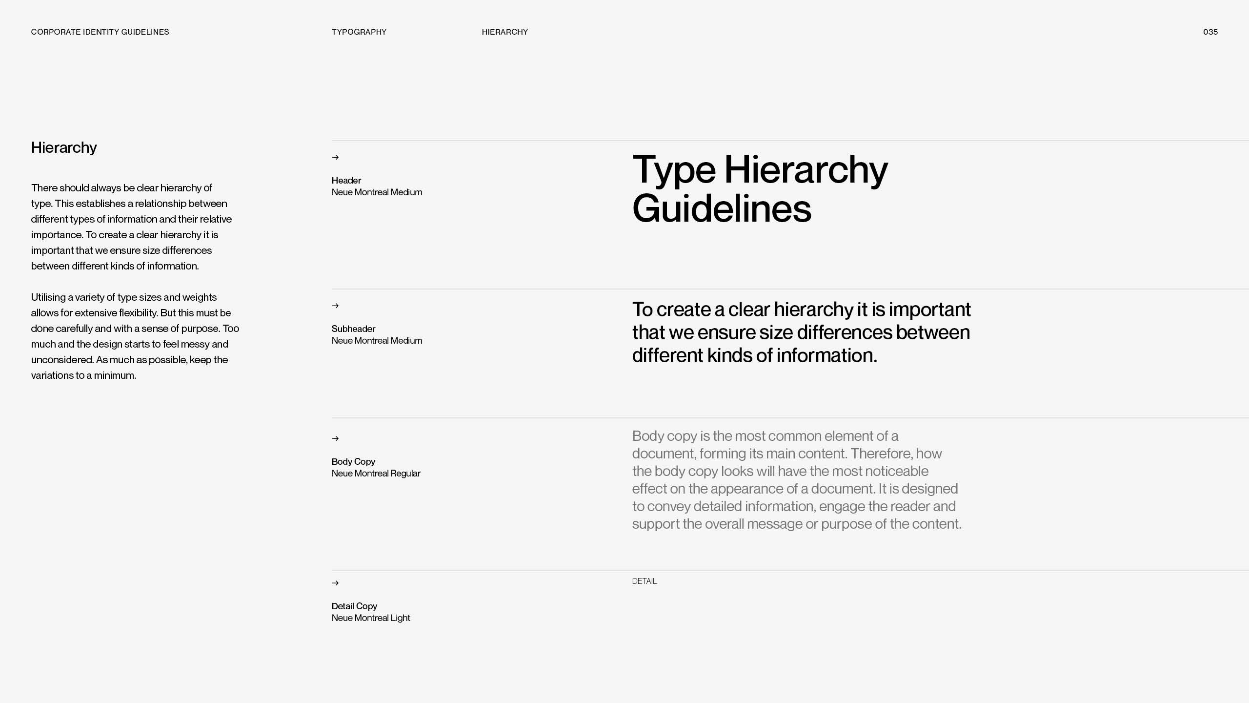
Hierarchy — clear size differences between header, subheader, body copy and detail copy; keep variations to a minimum.
Color
Black and white form the foundation, complemented by Peak Orange as the primary signal color and a seven‑step gray palette. Click any hex value to copy it.
3.1 Primary palette
Black and white are Peak’s primary colors and form the foundation of the brand identity. Using them as the base of the color system gives the visual language a minimal, timeless and elevated character.
Black
#000000
R0 G0 B0
C0 M0 Y0 K100
White
#FFFFFF
R255 G255 B255
C0 M0 Y0 K0
3.2 Gray palette
Peak’s gray palette consists of seven gray values and provides a flexible foundation for backgrounds, typography, interfaces and UX design elements, creating a consistent and balanced visual system that supports the brand colors.
Gray 1
#F5F5F5
R245 G245 B245
C3 M2 Y2 K0
Gray 2
#E6E6E6
R230 G230 B230
C9 M6 Y7 K0
Gray 3
#D6D6D6
R214 G214 B214
C15 M11 Y12 K0
Gray 4
#A5A5A5
R165 G165 B165
C38 M30 Y31 K0
Gray 5
#767676
R118 G118 B118
C55 M47 Y46 K12
Gray 6
#575757
R87 G87 B87
C63 M55 Y55 K30
Gray 7
#434343
R67 G67 B67
C67 M60 Y59 K44

3.3 Primary signal color
Peak Orange is the brand’s primary signal color and the strongest visual identifier of the Peak identity. It represents energy and confidence, communicating a sense of power, and forward momentum. Used across typography, backgrounds, logos, and graphic elements, orange creates a bold and recognisable presence while ensuring strong brand recognition.
As the core color of the Peak system, it brings warmth and intensity to the minimal black and white foundation, creating a balance between a premium aesthetic and an energetic brand expression. A range of lighter and darker orange values is introduced to create depth, flexibility, and hierarchy within the visual system.
Peak Orange
#FF6100
R255 G97 B0
C10 M76 Y100 K0
3.4 Print vs. screen
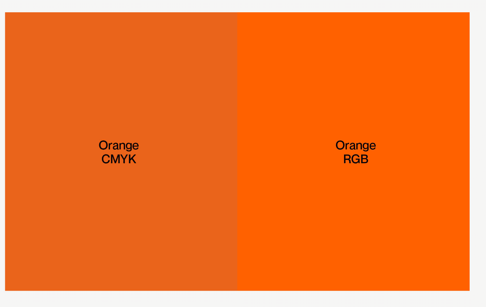
Due to the different color spaces, digital RGB colors may appear more vibrant than their printed CMYK equivalents.
Always use the CMYK values for print applications to ensure the closest match. Provide digital files in RGB and print files in CMYK color mode.
Print vs. screen — digital RGB appears more vibrant than printed CMYK; always use CMYK values for print.
3.5 Color misuse

Our color palette should not be misinterpreted, modified or added to.
Don’t use unapproved colors, don’t combine brand colors with each other unless there is a special reason, don’t use light low‑contrast combinations, don’t invent UI palette values, don’t adjust the transparency of colors, and don’t use light colors over white.
Color misuse — no unapproved colors, no combining brand colors, no low‑contrast pairings, no transparency changes.
Photography
When you use Peak imagery, keep text and logo clearly legible: use enough contrast, the black logo on bright images and the white logo on dark images.
4.1 Text on imagery
Select images with lots of space and low visual noise. If a busy photograph is important to the communication, feature branding and typography in a separate location.
Text and logo can appear on photographs as long as there is enough contrast for legibility. Typography can be rearranged to best accommodate a photograph — and if legibility is a concern, it can always be placed on a solid background.

Text on imagery — ensure contrast, rearrange to suit the image, or use a solid background; never place text on busy photographs.
4.2 Logo on photography
Only the white or black Peak primary logo may be used on top of photography. Place it in a corner or the middle, respecting the safe area, and always choose the variant with the strongest contrast against the image.


BLACK LOGO ON BRIGHT PHOTOS · WHITE LOGO ON DARK PHOTOS · CORNER PLACEMENT WITHIN THE SAFE AREA
Downloads
Everything you need to present the Peak brand: the logo files, our boilerplate and the image libraries. Never recreate brand assets manually — always use the provided files.




Boilerplate
Use this company description as is in event programs, press releases, speaker bios and on partner pages.
About Peak Energy
Founded in 2023, Peak Energy is delivering low-cost, giga-scale energy storage purpose-built to meet today’s grid challenges. Built by veterans from Tesla, Enovix, and Fluence, the company’s proprietary passive cooling platform makes grid-scale storage safer, simpler, and more affordable. The company has secured over $1 billion in commercial agreements, including deals with Jupiter Power, RWE, and Energy Vault, and in June 2026 announced a strategic partnership with General Motors, backed by a GM Ventures investment, to develop next-generation storage cells purpose-built for the grid. Peak is scaling domestic production through a new 4GWh manufacturing facility in Sacramento, California. For more information, visit www.peakenergy.com.
Image Libraries

Peak Visuals
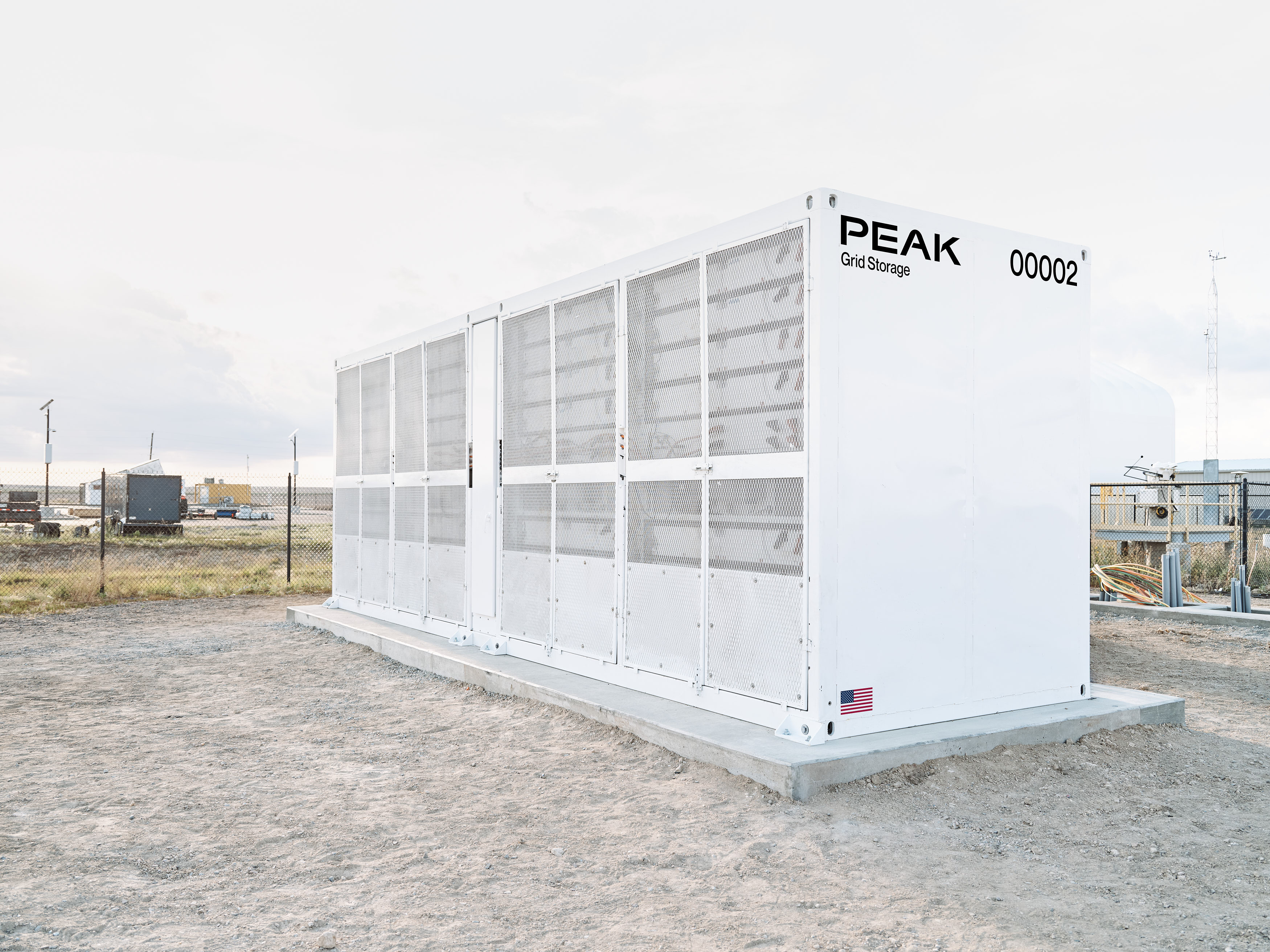
Product – GS1.1

ESS Gigafactory Sacramento

Executive Team
Questions, concerns, thoughts or need more information?
Please reach out to the Marketing team with any branding or communications questions. Lucas Breuer · lucas.breuer@peakenergy.com