Brand Guidelines
Corporate Identity Guidelines
CONTENTS
Logo
The logo is the primary identifier of Peak. It is only used in black or white and must never be reproduced in any other color. Keep clear space around it equal to the cap height, and never go below 9 px height in digital or 3 mm in print.


1.1 Logo suite
The Peak logo is the primary logo and should be used in all standard applications. It is the preferred expression of the brand, allowing the Peak name to build strong recognition over time. The Peak + Tagline lock‑up is used when additional context is needed — this is the preferred choice over the “Peak Energy” logo, as it gives the Peak logo space to stand on its own while the caption communicates additional information.
The Peak Energy logo is reserved for specific contexts where the Peak logo alone does not provide sufficient clarity about the company or its activities. It should only be used when explicitly required.
The primary logo — used most frequently, in all standard applications.
Used when additional context is needed. Distance to tagline = 1/4 of the logo height.
Reserved for contexts where Peak alone doesn’t provide sufficient clarity. Only when explicitly required.
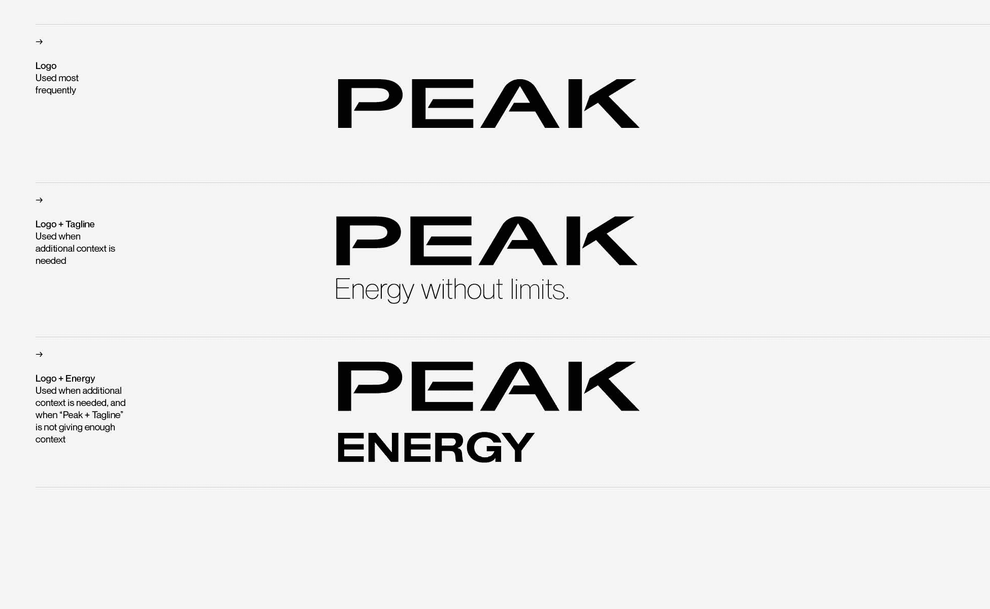
Logo suite — the primary Logo is used most frequently; Logo + Tagline when additional context is needed; Logo + Energy only when explicitly required.
1.2 Primary logo

The logo is the primary identifier of Peak. It is employed to quickly communicate our name and identity. It is a central element in our visual communication system.
The primary Peak wordmark — the preferred expression of the brand.
1.3 Logo clearspace

When placing other elements near the logo, use X as a metric for determining space allowance. X is equal to the cap height of the Peak logo.
Logo clearspace — use X as the space allowance metric, where X equals the cap height of the Peak logo.
1.4 Logo + tagline construction

The distance between the Peak logo and the tagline is always 1/4 of the height of the Peak logo. The textbox of the tagline “Energy without limits.” ends at the first part of the letter K.
When placing the logo and tagline, never recreate or adjust the composition manually — always use the provided SVG or Adobe Illustrator vector files to ensure the construction, spacing and proportions remain consistent across all applications. The logo construction always remains the same, regardless of the logo size.
Logo + tagline construction — the distance between logo and tagline is always 1/4 of the logo height; the tagline textbox ends at the first part of the letter K.
1.5 Logo + tagline clearspace

When placing other elements near the logo and tagline, use X as a metric for determining space allowance. X is equal to the cap height of the Peak logo.
Logo + tagline clearspace — X equals the cap height of the Peak logo.
1.6 Logo + Energy construction

The distance between the Peak logo and the word ENERGY is 2.25 times smaller than the cap height of the logo.
The word ENERGY ends after the middle part of the letter A. Never recreate or adjust the composition manually — always use the provided vector files.
Logo + Energy construction — the distance is 2.25 times smaller than the cap height; the word ENERGY ends after the middle part of the letter A.
1.7 Logo + Energy clearspace

When placing other elements near the logo and the word ENERGY, use X as a metric for determining space allowance. X is equal to the height of the symbol.
Logo + Energy clearspace — X equals the height of the symbol.
1.8 Logo color usage
The logo should always be used with consistent, legible color across all applications. On light backgrounds use the black version. On darker backgrounds use the white version.
Always use the variant that provides the best visibility given the background color. The Peak logo is only used in black or white and must never be reproduced in any other color.

Color usage — black logo on white, white logo on black, black on gray, white on imagery. Always choose the variant with the best visibility.
1.9 Logo color
The Peak logo is only used in black or white and must never be reproduced in any other color.

Black
R0 G0 B0 · C0 M0 Y0 K100
#000000
White
R255 G255 B255 · C0 M0 Y0 K0
#FFFFFF
1.10 Scaling
The logo has been crafted to read well at all sizes. Avoid overly large use cases that cut off the logo, and always ensure the logo is easily read. Never go below 9 px height for the digital logo size and never crop the logo off.

Scaling — never crop the logo at large scales; 40 px is comfortably sized; never go below 9 px height in digital.
1.11 Scaling limitations
The minimum recommended height of the logo is 3 mm in height for print and 9 px for digital. Never reduce the logo below the minimum sizes specified to ensure legibility and brand recognition.
The logo has been carefully crafted to read well, even in small sizes. There is no limit at large scale, but be careful at smaller sizes.
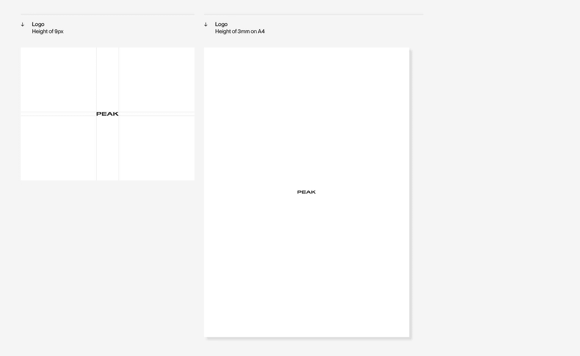
9 px — minimum digital height
3 mm on A4 — minimum print height
Shown at true scale. Never reduce the logo below these sizes.
Scaling limitations — minimum 9 px height for digital and 3 mm for print. There is no limit at large scale.
1.12 Scaling in composition
Always be sure the elements can be easily seen and understood. Do not crop identity elements. Always align the logo to the layout grid to ensure its size remains proportional to the format.

Scaling in composition — too small for the composition · scaled correctly · too large. Align the logo to the layout grid.
1.13 Logo placement
Our wordmark can appear in the corners or in the middle of the page. Just give it plenty of space and make sure it’s optically aligned.

Placement — the wordmark can appear in the corners or the middle of the page; give it plenty of space and align it optically.
1.14 Logo misuse
Do not diminish the value of our logo. It is important that the appearance of the logo remains consistent. The logo should not be misinterpreted, modified or added to.
No attempt should be made to alter the logo in any way. Its orientation and composition should remain as indicated in this document.

Misuse — don’t distort or warp, don’t outline, don’t add effects or drop shadows, don’t rotate, don’t change tone, tint, opacity or the type.
1.15 Logo & photography
When adding the Peak logo on top of photography, select images with lots of space and low visual noise.
If a busy photograph is important to the communication, use a layout that features the branding and typography in a separate location rather than on top of the photograph. Only use the white or black Peak primary logo on top of photography.

Logo & photography — black logo on bright photos, white on dark photos, corner placement respecting the safe area. Never place the logo on busy areas.
Typography
Neue Montreal is our primary brand typeface — a modernist sans serif selected for its timelessness, simplicity and functionality. Always default to Neue Montreal. Peak uses four weights only: Light, Regular, Medium and Bold.
Quick reference
A cheat‑sheet of the most used values. Every topic is explained in full in the sections below.
Type size — digital (desktop)
86 px
48 px
29 px
20 px
16 px / 21 px leading
13 px
11 px
Leading
Headlines set solid (130/130). Subheaders and body copy +5 pt (16/21). Captions loose, auto leading.
Tracking
Display +10 · headers, subheaders & body 0 · detail copy +25.
Case‑setting
Headers in Title Case, subheaders and body in sentence case, details in UPPERCASE. Never mix case‑settings.
Line length
30–50 characters per line for short text, 40–80 for long text. Always left‑align — never justify or centre body copy.
ON LIGHT
Header — always Black
Subheader — Black, Orange or Gray 5
Body copy — Gray 5 #767676, highlight with Black or Orange
ON DARK
Header — always White
Subheader — White, Orange or Gray 5
Body copy — Gray 4 #A5A5A5, highlight with White or Orange
2.1 Primary typeface
The Neue Montreal type family is our primary brand typeface.It’s a modernist sans serif typeface, selected for its timelessness, simplicity and functionality. Neue Montreal provides clarity and contrast at smaller scales, making it the perfect functional typeface for us. Always default to Neue Montreal, to ensure you communicate easily with everyone.
Neue Montreal provides clarity and contrast at smaller scales, making it the perfect functional typeface for us. It is designed by Canadian type designer Mathieu Desjardins, founder of the type foundry Pangram Pangram.

Neue Montreal — uppercase, lowercase, figures and punctuation.
2.2 Weights & typeface usage
Type weight helps distinguish pieces of information and establish a hierarchy. Peak uses four weights from the Neue Montreal family: Light, Regular, Medium and Bold. Do not use any other weights.
Regular is used for body copy, Medium for headers, Bold as display typeface for large headers only, and Light for small detail copy. Whenever possible, use H1 in Neue Montreal Medium before opting for the Display style, reserving the bold weight for situations that truly require greater emphasis and scale.
The type hierarchy uses different weights of Neue Montreal to establish clear visual structure.
Neue Montreal Light is used for Small Detail Copy, including captions, labels, and other supporting information.
Neue Montreal Regular is used for Body Copy, providing optimal readability for longer passages of text.
Neue Montreal Medium is used for Headers and Subheaders (H1–H3), creating a clear hierarchy while maintaining a modern appearance.
Neue Montreal Bold is reserved exclusively for Display typography on large-format print and digital applications, such as banners, posters, and large screens, where maximum visual impact is required. Whenever possible, use H1 in Neue Montreal Medium before opting for the Display style, reserving the bold weight for situations that truly require greater emphasis and scale.
Setup
Small detail copy — captions & labels. Set in UPPERCASE, tracking +25.
300
Body copy — optimal readability for longer passages. Tracking 0, leading +5 pt.
400
Headers & subheaders (H1–H3). Tracking 0, headers set solid (1:1).
500
Display only — large-format print & digital where maximum impact is required. Tracking +10.
700

Typeface usage — tracking and leading specifications per role.
2.3 Typographic metrics
Typographic metrics define the proportions and spacing of the typeface, shaping its readability and visual character. The x‑height is the height of lowercase letters such as x, influencing legibility and the perceived size of the type.
The cap height measures the height of uppercase letters. Ascenders extend above the x‑height (b, d, h), while descenders extend below the baseline (g, p, y).

Typographic metrics — ascender, cap height, x‑height, baseline and descender shape readability and visual character.
2.4 Leading
Leading describes the vertical space between lines of text. Headlines (H1) are set solid — leading equal to the type size (130 pt type with 130 pt leading) creates a balanced, harmonious vertical rhythm.
Subheadings (H2) are set 5 pt larger than the type size (60/65), improving readability with a lighter, more open appearance. Body copy is set 5 pt larger than the type size (16/21). Captions are set loose with auto leading (e.g. 14 × 1.2 = 16.8).

Leading — headlines set solid (130/130 pt), subheaders +5 pt (60/65), body copy +5 pt (16/21), captions loose with auto leading.
2.5 Baseline grid
The baseline grid creates a consistent vertical rhythm by aligning text and layout elements across the page. It should be determined by the leading of the body copy — if body text is set at 15 pt with 20 pt leading, use a 20 pt increment.
All typographic elements should align to the baseline grid whenever possible, with body copy alignment as the highest priority. In InDesign: Preferences → Grids to define the increment, View → Grids & Guides → Show Baseline Grid, then apply Align to Baseline Grid to text frames.

Baseline grid — determined by the leading of the body copy; align all typographic elements to it whenever possible.
2.6 Tracking
Tracking refers to the overall space between characters. For headlines and subheads we use 0 units of tracking. For Display headlines use +10. For detail copy use +25. Body copy is usually left as designed: 0 units of tracking.

Tracking — Display +10, headers & subheaders 0, body copy 0, detail copy +25.
2.7 Type size — digital
The typography system is built on a responsive scale that adapts across digital environments. Larger formats prioritize impact and readability from a distance, while smaller formats reduce type size while maintaining the same hierarchy and spacing relationships.
When adjusting typography, scale all type levels proportionally together to preserve the intended visual balance of the system.
Type size digital — the responsive scale for desktop, tablet and phone; scale all levels proportionally together.
2.8 Type size — print
Typography scales proportionally across A‑formats. Use these values as guidelines — final type sizes should be adjusted optically according to content density, viewing distance and layout, while maintaining a consistent typographic hierarchy.
Use the Type Size Formula to calculate the proportions.
Type size print — proportional scaling across A‑formats (A5, A4, A2, A0); adjust optically while keeping the hierarchy.
2.9 Type size — formula
Instead of fixed sizes, all text styles are calculated in relation to the body text, creating a flexible system for print and digital.
Body text is the base size (1×); all other styles scale proportionally: Display 4.8–6×, Header H1 2.8–3.2×, Subheader H2 1.6–2×, Caption 0.8×, Label 0.7×. These values are guidelines and can be adjusted optically to ensure readability, hierarchy and visual balance.

Type size formula — all styles are calculated relative to the body text (1×), from Label at 0.7× up to Display at 4.8–6×.
2.10 Hierarchy
There should always be clear hierarchy of type, establishing a relationship between different kinds of information and their relative importance. Ensure size differences between different kinds of information.
A variety of sizes and weights allows flexibility — but use it carefully and with purpose. Too much and the design feels messy and unconsidered; keep variations to a minimum.
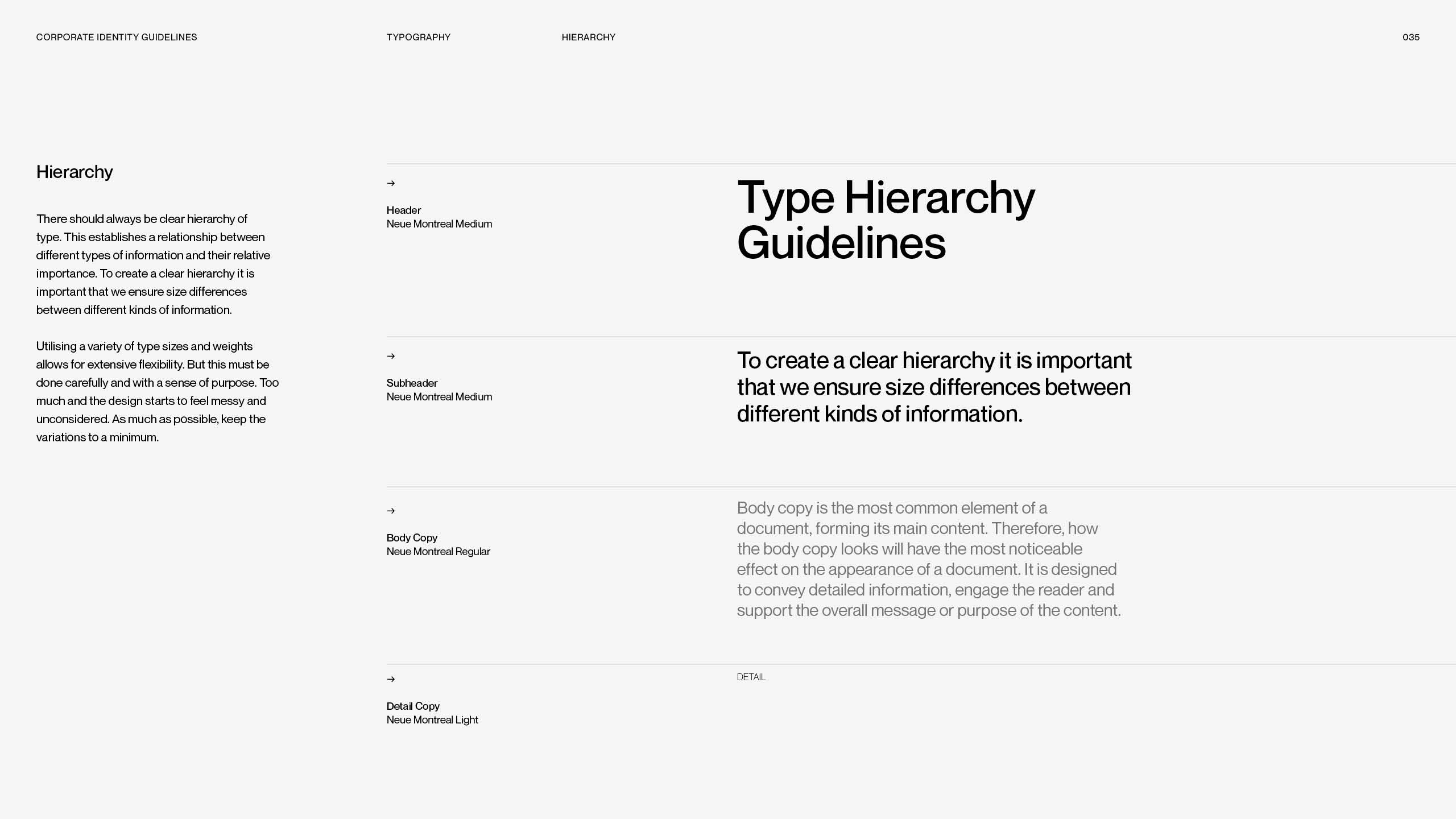
Hierarchy — clear size differences between header, subheader, body copy and detail copy; keep variations to a minimum.
2.11 Gray scale hierarchy
Gray 5 is the default color for both body copy and detail copy. For more complex layouts requiring additional hierarchy, the full gray scale from Gray 2 – Gray 7 may be used.
Use darker grays for information that should draw attention and lighter grays for supporting information (vice versa on black backgrounds). Apply the gray scale purposefully and consistently.

Gray scale hierarchy — Gray 5 is the default for body and detail copy; Gray 2–7 may create additional levels on light and dark backgrounds.
2.12 Text color hierarchy — light
Header: always Black. Subheader: Black, Orange or Gray 5 — default to Black when there is no clear association. Body copy: Gray 5 (#767676); individual words or short phrases may be highlighted using Black or Orange. Detail copy: always Gray 5.

Text color hierarchy on light — header always Black; subheader Black, Orange or Gray 5; body Gray 5 with Black or Orange highlights.
2.13 Text color hierarchy — dark
Header: always White. Subheader: White, Orange or Gray 5. Body copy: Gray 4 (#A5A5A5); individual words or short phrases may be highlighted using White or Orange. Detail copy: always Gray 4.

Text color hierarchy on dark — header always White; subheader White, Orange or Gray 5; body Gray 4 with White or Orange highlights.
2.14 Footnotes & disclaimers
Footnotes and disclaimers use the same typographic style as body text, set in Gray 5. The footnote size is reduced to 0.7–0.8 × the body text size (body 12 pt → footnote 8–9 pt).
A divider line always separates footnotes from the main content; its length is half the width of the footnote text box. Footnotes should be used for supporting information, legal notes, references or additional details only. Use uppercase typography for footnote numbers.

Footnotes & disclaimers — Gray 5, 0.7–0.8 × body size, with a divider line half the width of the footnote textbox.
2.15 Case-setting
The case‑setting of typography indicates the tone of our voice in the written word. Each typographic role requires its own case‑setting: headers in Title Case, subheaders in sentence case, body copy in sentence case, details in UPPERCASE.

Case‑setting per role — headers in Title Case, subheaders and body in sentence case, details in UPPERCASE.
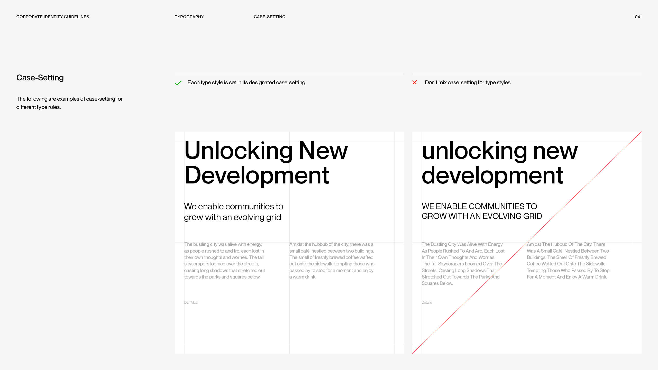
Case‑setting — each style in its designated case; never mix case‑settings between type styles.
2.16 Spacing
Spacing between blocks of text allows for better legibility. There are no strict rules for spacing — however, use the cap height as a starting place and minimum space metric between text.

Spacing — use the cap height as the minimum spacing metric between blocks of text.
2.17 Line length
Don’t create lines of text that are too short or too long. For shorter text, aim for 30 to 50 characters per line; for long text, 40 to 80. Always use Neue Montreal Regular for body copy and Medium for subheadings.

Line length — 30–50 characters per line for short text, 40–80 for long text; stay inside the safe zone.
2.18 Bullets & lists
Bullets and list markers organize content and improve readability. They may only come from the Neue Montreal typeface and should match the size and weight of the accompanying body text.
Use bullets for related information or short lists; keep items concise and parallel. Use numbered lists only when the order matters. To separate lists from body text, increase leading by +10 pt above the text size (18 pt text → 28 pt leading).

Bullets & lists — markers only from Neue Montreal, matching the body text; numbered lists only when order matters; leading +10 pt.
2.19 Principles
The following outlines the best practices for typesetting. Use them any time the brand typefaces are used.

✓ Always place type along the grid — ✕ don’t leave type floating.

✓ Always left‑align typography — ✕ don’t right‑align, justify or centre.

✓ Use white space — ✕ don’t overcrowd the composition.

✓ Keep margins open and spacious — ✕ don’t overcrowd the grid with typography.
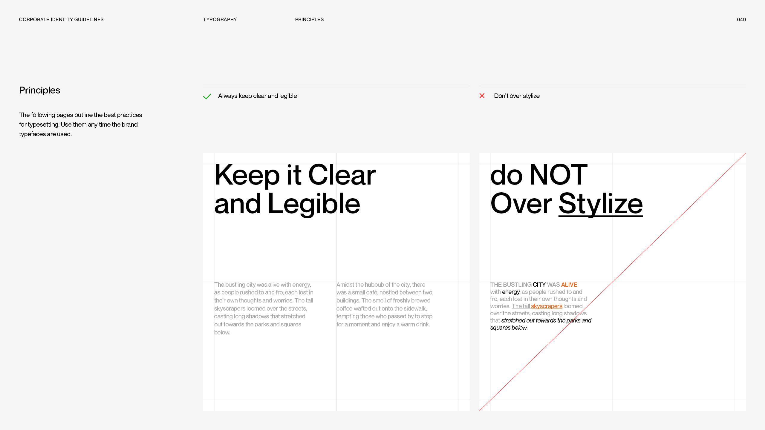
✓ Keep it clear and legible — ✕ don’t over‑stylize.
2.20 Typography misuse
Our typographic voice is strengthened when used with proper stylings.
Do not diminish our written voice: don’t use unapproved typefaces, don’t apply effects to typography, don’t use too much or too tight leading, and don’t allow the tracking to be too wide or too tight.

Typography misuse — don’t use unapproved typefaces · don’t apply effects to typography · don’t use too much leading · don’t use too tight leading · don’t allow the tracking to be too wide · don’t allow the tracking to be too tight.
Color
Black and white form the foundation, complemented by Peak Orange as the primary signal color, four secondary colors and a seven‑step gray palette. Click any hex value to copy it.
3.1 Color palette overview
Peak’s primary colors are black and white, forming the foundation of the brand identity. This base achieves a minimal, timeless and elevated aesthetic, complemented by orange as the primary signal color, four secondary colors and a gray palette.

Color palette overview — black and white foundation, orange signal color, four secondary colors and the gray palette.
3.2 Primary palette
Black and white are Peak’s primary colors and form the foundation of the brand identity. Using them as the base of the color system gives the visual language a minimal, timeless and elevated character.
Black
#000000
R0 G0 B0
C0 M0 Y0 K100
White
#FFFFFF
R255 G255 B255
C0 M0 Y0 K0
3.3 Gray palette
Peak’s gray palette consists of seven gray values and provides a flexible foundation for backgrounds, typography, interfaces and UX design elements, creating a consistent and balanced visual system that supports the brand colors.
Gray 1
#F5F5F5
R245 G245 B245
C3 M2 Y2 K0
Gray 2
#E6E6E6
R230 G230 B230
C9 M6 Y7 K0
Gray 3
#D6D6D6
R214 G214 B214
C15 M11 Y12 K0
Gray 4
#A5A5A5
R165 G165 B165
C38 M30 Y31 K0
Gray 5
#767676
R118 G118 B118
C55 M47 Y46 K12
Gray 6
#575757
R87 G87 B87
C63 M55 Y55 K30
Gray 7
#434343
R67 G67 B67
C67 M60 Y59 K44

3.4 Primary signal color
Peak Orange is the brand’s primary signal color and the strongest visual identifier of the Peak identity. It represents energy and confidence, communicating a sense of power, and forward momentum. Used across typography, backgrounds, logos, and graphic elements, orange creates a bold and recognisable presence while ensuring strong brand recognition.
As the core color of the Peak system, it brings warmth and intensity to the minimal black and white foundation, creating a balance between a premium aesthetic and an energetic brand expression. A range of lighter and darker orange values is introduced to create depth, flexibility, and hierarchy within the visual system.
Peak Orange
#FF6100
R255 G97 B0
C10 M76 Y100 K0
3.5 Secondary palette
Inspired by Bauhaus color theory, the Peak color system is complemented by four secondary colors: yellow, blue, green and red. Together with black, white and orange they create a rich, flexible system that adapts across applications while maintaining a cohesive identity.
Some secondary colors may appear too intense for certain applications — in these cases refer to the extended color palette for additional values and variations of each tone, and always use the exact color values defined within the brand system.
Yellow
#FBF517
R251 G245 B23
C6 M0 Y91 K0
Blue
#015AFF
R1 G90 B255
C82 M66 Y0 K0
Green
#537D78
R83 G125 B120
C70 M37 Y50 K11
Red
#FF0000
R255 G0 B0
C0 M99 Y100 K0
3.6 Secondary colors in use
Each secondary color carries its own meaning within the system.
Peak Orange always remains the primary signal color.
Yellow
Peak Yellow is a secondary color within the Peak color system, adding brightness, optimism, and visual contrast to the brand palette. It can be used for graphic elements, data visualisations, graphs, and selected digital and print applications where a lighter and more expressive tone is preferred.
While yellow provides flexibility and variety within the system, Peak Orange should always remain the primary signal color and main brand identifier.
A range of lighter and darker yellow values is introduced to create depth, flexibility, and hierarchy within the visual system.
Blue
Peak Blue is a secondary color within the Peak color system, adding trust, clarity, stability, and intelligence to the brand palette. It introduces a cooler and more balanced tone that supports communication, structure, and visual contrast.
Blue can be used for graphic elements, data visualisations, graphs, and selected digital and print applications, where a more calm, technical, or reliable expression is preferred.
While blue provides flexibility and depth within the system, Peak Orange should always remain the primary signal color and main brand identifier.
A range of lighter and darker blue values is introduced to create depth, flexibility, and hierarchy within the visual system.
Green
Peak Green is a secondary color within the Peak color system, adding growth, freshness, and connection to nature to the brand palette. It introduces a more organic and harmonious tone that supports communication, differentiation, and visual variety within the system.
Green can be used for graphic elements, data visualisations, graphs, and selected digital and print applications, where a more natural, sustainable, or balanced expression is preferred.
While green provides flexibility and depth within the system, Peak Orange should always remain the primary signal color and main brand identifier.
A range of lighter and darker green values is introduced to create depth, flexibility, and hierarchy within the visual system.
Red
Peak Red is a secondary color within the Peak color system, adding energy, passion, strength, and urgency to the brand palette. It introduces a bold and expressive tone that supports communication, differentiation, and visual impact within the system.
Red can be used for graphic elements, data visualisations, graphs, and selected digital and print applications, where a more dynamic, powerful, or attention-driven expression is preferred.
While red provides flexibility and depth within the system, Peak Orange should always remain the primary signal color and main brand identifier.
A range of lighter and darker red values is introduced to create depth, flexibility, and hierarchy within the visual system.
3.7 Extended color palette
Some colors within the secondary palette may appear too intense for certain applications. In these cases, refer to to this color palette for additional color values and variations of each tone. Always use the exact color values defined within the brand system to ensure consistency.
Although the majority of the brand expression should remain within the core color palette, a modern brand requires enough flexibility and variation to adapt across a wide range of applications. A defined range of tints and shades allows the palette to function effectively across digital and print environments.
3.8 Supporting palette
The supporting color palette extends should be used to communicate positive, negative, and attention-related states in a clear and consistent way.
Each supporting color is available in four tonal values. Select the appropriate tone based on the required level of emphasis.
– Use the green color scale for positive states.
– Use the red color scale for negative states.
– Use the orange color scale for attention states.
– Use the blue color scale for informative states.
Positive / Go — Use the green scale for positive states.
100
#DEE9E7
200
#BCD3CE
300
#92B6B0
400
#6C958F
Negative / Critical — Use the red scale for negative states.
100
#FFDDDD
200
#FFC0C0
300
#FF9494
400
#FF5757
Attention — Use the orange scale for attention states.
100
#FFEED3
200
#FFD9A5
300
#FFBD6D
400
#FF9632
Information — Use the blue scale for informative states.
100
#D6EBFF
200
#B5DCFF
300
#83C8FF
400
#48AAFF
Orange in use & color rules
3.9 Orange — text color
Peak Orange can be applied as a color for subheadings to create immediate visual hierarchy and strengthen the relationship between typography and the Peak brand identity.
Orange titles help key information stand out and reinforce Peak’s visual language.
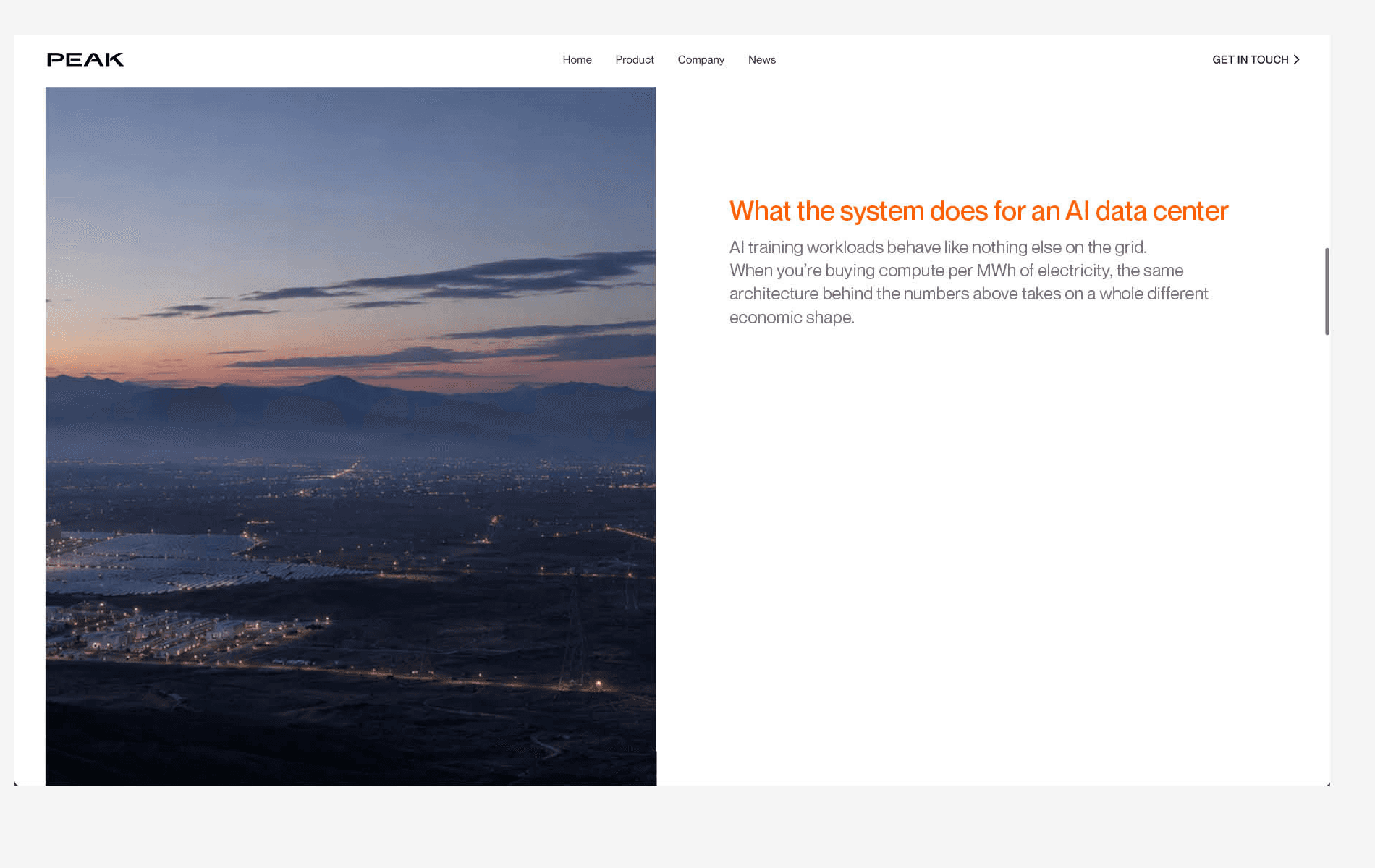
Orange as subheading color — creates immediate visual hierarchy and strengthens the brand connection.
3.10 Orange — text highlight
Apply orange to subheaders, highlighted words or selected parts of text to create visual hierarchy and draw attention to important messages. The use of orange strengthens the connection to Peak, making content instantly recognisable.

Orange text highlight — emphasise key information in subheaders and body copy.
3.11 Orange — graphic elements
Peak Orange can be used for graphic elements such as buttons, shapes, lines, icons, illustrations, data visualisation, highlights, patterns, dividers and UI components.
Applying orange strengthens brand recognition and adds depth and hierarchy to the visual language.

Orange graphic elements — buttons, shapes, lines, icons, illustrations, data visualisation, highlights, patterns, dividers and UI components.
3.12 Type and color

Always be sure there is enough contrast between the type and the background. On light colors use black text; on dark colors use white text.
Contrast in color and typography is the most important factor — always be sure the type is clear and legible, and avoid low‑contrast combinations.
Type and color — black type on white, white type on black; contrast is the most important factor.

Type on color — approved type and color combinations; always ensure the type stays clear and legible.
3.13 Color combinations

Always be sure there is enough contrast between foreground and background. On lighter backgrounds avoid light colors with low contrast; on darker backgrounds avoid dark colors.
With gray values, use lighter grays on black backgrounds and darker grays on white. Avoid combining brand colors with one another — colors should only be paired with white, black or gray values to maintain a clear and consistent identity.
Color combinations — colors pair only with white, black or gray values; crossed‑out pairings are not allowed.
3.14 Color blocks

Color blocks create structure, hierarchy and visual emphasis while maintaining Peak’s clean, minimal aesthetic. Color should always be applied intentionally and support the content rather than dominate it.
Only black, white, orange, the secondary palette and the gray palette are permitted. Always ensure sufficient contrast when placing text on a color block.
Color blocks — only black, white, orange, the secondary palette and the gray palette are permitted.
3.15 Logo color backgrounds

When using the logo on color, always make sure there is enough contrast between the background color and the logo.
The black logo and the white logo on colored backgrounds — always with enough contrast.
3.16 Print vs. screen
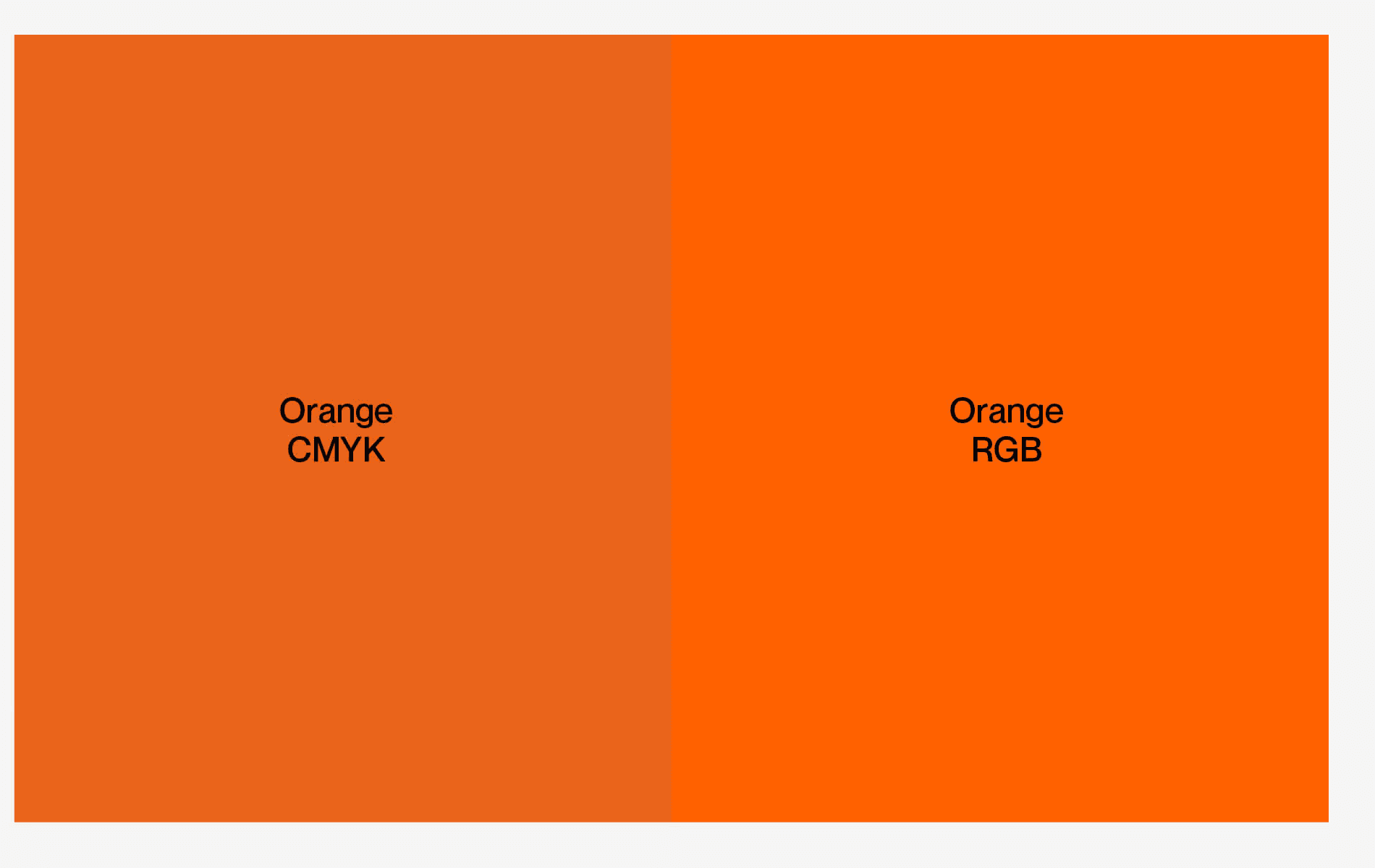
Due to the different color spaces, digital RGB colors may appear more vibrant than their printed CMYK equivalents.
Always use the CMYK values for print applications to ensure the closest match. Provide digital files in RGB and print files in CMYK color mode.
Print vs. screen — digital RGB appears more vibrant than printed CMYK; always use CMYK values for print.
3.17 Color misuse

Our color palette should not be misinterpreted, modified or added to.
Don’t use unapproved colors, don’t combine brand colors with each other unless there is a special reason, don’t use light low‑contrast combinations, don’t invent UI palette values, don’t adjust the transparency of colors, and don’t use light colors over white.
Color misuse — no unapproved colors, no combining brand colors, no low‑contrast pairings, no transparency changes.
Grid System & Layouts
The foundation of our layouts is a simple, flexible grid with minimal margins that positions elements toward the edges — putting the focus on our imagery. Margins = shortest side ÷ 16 (or ÷ 32 for tighter margins). Gutters = margin ÷ 2.

4.1 Grid construction
Grid Construction
Margin size is between 2-6% of the width of the layout. Large layouts, like billboards or signage can use 5-6% margins.
Refer to the diagrams for grid construction. As a starting place divide the shortest side of the application by 16, to determine the margin size. And divide margin by 2 to determine gutter size. Round up margin and gutter values to the nearest unit. Always use your best judgment when creating new grids.
Ex: With a document size of 210mm x 297mm (A4), the shortest side will be 210. Margin will be 12mm and gutters of 6mm.
Creating Margins in InDesign
First create a new document with your intended page size. Go to the top menu Layout > Margins and Columns. Enter margin size.
Creating Grids in InDesign
Go to Layout > Create Guides. Click Preview button and Fit Guides to Margins. Next enter gutter size. Followed by the number of columns and rows required.
Step 1 margins:
divide the application’s shortest side by 16 (larger margin) or 32 (tighter margin); below 100 px use 8. Margins run 2–6% of the layout width; large formats like billboards can use 5–6%.
Step 2 columns & rows:
choose grid complexity by the rule of thirds — 3 columns for the content grid, 6 or 12 for complex layouts.
Step 3 gutters:
half the size of the margin (margin ÷ 2). Example: on A4 (210 × 297 mm), margin 12 mm and gutters 6 mm. In InDesign: Layout → Margins and Columns for margins; Layout → Create Guides, Fit Guides to Margins, then gutter size, columns and rows.

4.2 Flexibility
Flexibility — the grid flexes across a variety of format sizes. Using the rule of thirds, divide the layout into 3, 6 or 12 columns and add enough rows to create square‑like modules.
Simple applications require fewer columns and rows; complex applications require more. Always use your best judgment.

4.3 Applying type
Headers are the largest type on the page, applied relative to margins, format size and line length. Subheads are applied relative to the header and should not exceed 50% of its type size; keep enough breathing room between header and subhead.
Body copy is relative to subheads and forms the main content. If more information is required, use small detail copy — the smallest text on the layout, less than 50% of the subhead.

Applying type — headers relative to margins and format; subheads no larger than 50% of the header; detail copy under 50% of the subhead.
4.4 Applying logo
The minimum width of the logo should be the width of one column, so it scales proportionally with each application.
For billboard use, the logo size can increase for visibility at the designer’s discretion. Elements don’t have to fit perfectly into each module — in reality, the grid will not be visible.

Applying logo — the minimum logo width is one column, so the logo scales proportionally with each application.
4.5 Multiple formats
The grid system creates strong visual unity within campaigns by aligning and scaling design elements across a diverse range of layout shapes and sizes — ensuring hierarchy, recognition and cohesion across platforms and devices.
Make sure the Peak logo is aligned in the corners or in the middle of the format.

Multiple formats — the grid aligns and scales elements across presentations, ads and OOH; keep the logo in the corners or middle.
4.6 Extreme formats
In some cases, a format will require the grid to be one column wide or one row tall. Margins and gutters may need to be adjusted at the designer’s discretion.

Extreme formats — one column wide or one row tall; adjust margins and gutters at the designer’s discretion.
Graphic Elements
Iconography, corner radius, chart style and lines — the supporting graphic language of Peak. Icons come from Phosphor Icons in regular or thin weight, colored black, gray or orange. Corner radii use 6–16 px for UI components.
5.1 Iconography
We use a comprehensive collection of icons to speak to community elements, highlight product features and show core functionality.
Phosphor Icons has a wide variety of categories — use either the regular or thin weight, keeping it consistent throughout the application. Icons can be customized in color, weight, size and format; use black, the gray values or orange as the color.
All Phosphor icons — search by name or tag, switch between the two approved weights (Regular / Thin) and the approved colors, and click any icon to download its SVG.
5.2 Corner radius
Corner radii create a soft visual language. Use a corner radius between 6 px and 16 px for UI components, containers and graphic elements — 0 px is shown only as the “no radius” comparison.
Select the radius based on the size and purpose of the element: larger shapes may require a larger radius, while smaller elements benefit from a more subtle one.
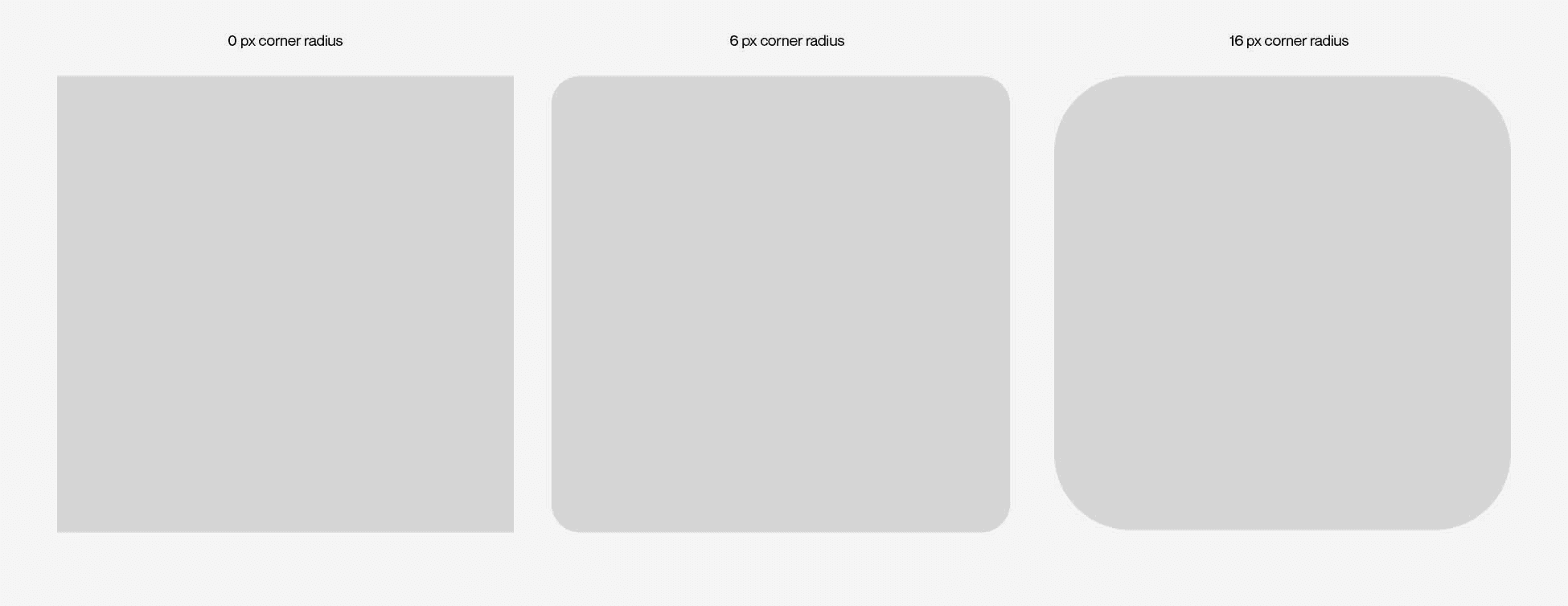
Corner radius — 0 px (no radius, for comparison) · 6 px · 16 px.
5.3 Data visualization style
Data visualisations should communicate information clearly, consistently, and in alignment with the Peak visual identity. All charts, graphs, and diagrams should follow a clean and structured approach, prioritising readability and simplicity.
For presentations, use the templates provided by TheMasterSlides to ensure consistency across all slide-based data visualisations.
Color Usage
Data visualisations should primarily use the approved Peak color palette: White, black, the four secondary colors and the gray palette. If other colors are required, refer to the extended color palette for approved hues and variations.Additional colors may be introduced when they are necessary to communicate specific information, such as differentiating categories, highlighting key data points, or improving data comprehension.
Typeface
Use Neue Montreal Light, Regular or Medium based on the hierarchy of information.

Data visualization style — clean, structured, readable; Neue Montreal Light, Regular or Medium by hierarchy.
5.4 Data visualization color
Always prioritise Peak Orange and the Gray palette, then the secondary colors. Use different shades of Peak Orange for data connected to Peak — this creates an immediate association and strengthens brand recognition.
Use the Gray palette when a more minimal, neutral or professional appearance is required, Orange together with the Secondary palette when greater contrast and clearer differentiation is needed, the Two Tone palette when comparing two parties or categories, and the bright tones to avoid overly colorful or visually heavy compositions.

Data visualization color styles — Orange palette (priority) · Gray palette (priority) · Orange & Secondary (priority) · DuoTone · Bright tone.
5.5 Chart palettes
Click any value to copy it, or copy a full palette to set up a new file.
Orange Palette (priority)
#461504
#A1360B
#FF6100
#FF9632
#FFD9A5
Gray Palette (priority)
#000000
#575757
#A5A5A5
#D6D6D6
#F5F5F5
Orange & Secondary (priority)
#FF6100
#FBF517
#015AFF
#537D78
#FF0000
DuoTone Palette
#FF6100
#FF9632
#575757
#A5A5A5
#D6D6D6
Bright Tone
#FFEED3
#FCFFC3
#D6EBFF
#DEE9E7
#FFDDDD
5.6 Lines
Lines create structure, separate content and reinforce visual hierarchy — applied with purpose and never as decoration. Stroke weight: 0.5–1 pt for print and 1 px for digital, scaled proportionally for large formats.
Color: only approved brand colors. Usage: separate sections, support layouts and alignment, divide footnotes from main content, highlight structure without drawing unnecessary attention.

Lines — structural, subtle, never decorative; 1 px digital, 0.5–1 pt print, in approved brand colors only.
Photography
Imagery is always cropped to defined aspect ratios — preferred 3:4 vertical and 4:3 horizontal — maintains a strong focal point and leaves negative space for typography.
6.1 Aspect ratios
To ensure consistency across all applications, imagery should always be cropped using the defined aspect ratios below.
To create a consistent visual appearance, the preferred image aspect ratios are 3:4 and 4:3. Other aspect ratios should only be used when required by the application, for instance 9:16 for an Instagram Story.
When cropping an image, always define the required format by using the width × height ratio. The first value represents the width, while the second value determines the height in relation to the width.
For example, a 3x4 ratio means that for every 3 units of width, the image height should be 4 units. Use these proportions to calculate the correct image dimensions and avoid inconsistent cropping or image distortion.

Aspect ratios — imagery is always cropped to the defined ratios; preferred are 3:4 vertical and 4:3 horizontal. Other ratios only when the application requires it (e.g. 9:16 for an Instagram Story). Define the format as width × height: a 3x4 ratio means for every 3 units of width, 4 units of height. Use these proportions to avoid inconsistent cropping or distortion.
6.2 Cropping guideline
When cropping images, always maintain a strong focal point and preserve the intended composition. Avoid cropping through faces, important subjects or key design elements.
Ensure sufficient negative space when imagery is used alongside typography. Apply the same cropping principles across image series for balance and coherence. Never stretch, squeeze or distort imagery to fit a required format.

Cropping — keep a strong focal point and negative space; never stretch, distort or crop through faces and key elements.
6.3 Text on imagery
Select images with lots of space and low visual noise. If a busy photograph is important to the communication, feature branding and typography in a separate location.
Text and logo can appear on photographs as long as there is enough contrast for legibility. Typography can be rearranged to best accommodate a photograph — and if legibility is a concern, it can always be placed on a solid background.

Text on imagery — ensure contrast, rearrange to suit the image, or use a solid background; never place text on busy photographs.
6.4 Text in imagery
Position text either in the upper or bottom corners of the image or centrally to create a clear, balanced composition.
Ensure sufficient contrast — white typography on dark images, black on light images. Always respect a safety margin when placing text on imagery.

Text in imagery — place text in the corners or the middle, white on dark and black on light, always respecting the margin.
6.5 Logo on photography
Only the white or black Peak primary logo may be used on top of photography. Place it in a corner or the middle, respecting the safe area, and always choose the variant with the strongest contrast against the image.


BLACK LOGO ON BRIGHT PHOTOS · WHITE LOGO ON DARK PHOTOS · CORNER PLACEMENT WITHIN THE SAFE AREA
Application
How the brand comes to life across stationery, presentations and social channels — every touchpoint clean, functional and consistent.
7.1 Business cards
The business card is a key brand touchpoint and serves as a personal introduction to Peak, used for networking, meetings, conferences and all professional interactions. The design remains clean, functional and consistent across all applications.
The front shows the Peak logo and tagline. All text on the back is set in 9 pt with auto leading: the employee’s name in Neue Montreal Medium black; job title, email, telephone, website and all other contact information in Neue Montreal Regular, Gray 5.

Business cards — a key brand touchpoint and personal introduction to Peak, used for networking, meetings and conferences. The front shows the Peak logo and tagline. All text on the back is set in 9 pt with auto leading: the employee’s name in Neue Montreal Medium black; job title, email, telephone, website and other contact information in Neue Montreal Regular, Gray 5.
7.2 Letterhead
The letterhead is the primary identifier of all official correspondence. The logo is placed on the right‑hand side and occupies one‑fourth of the width of an A4 format, based on a four‑column grid.
Contact information — telephone, postal address and email — sits at the bottom of the page in 10 pt Gray 5, structured by a 0.5 pt line in the same gray. The spacing between the information and the line equals the cap height of the text.

Letterhead — logo right at 1/4 of the A4 width; contact block at the bottom in 10 pt Gray 5 with a 0.5 pt line.
7.3 Email signature

Email signature — Helvetica Neue Regular 10/15 pt; ends with the black Peak logo matching the website link length.
7.4 Slide deck
Always use the approved TheMasterSlides templates, designed to align with the Peak brand, for all internal and external presentations.
Available templates: Planning, Finance, Marketing, Strategy — select the one that best matches the purpose of your presentation.

Slide deck — always use the approved TheMasterSlides templates: Planning, Finance, Marketing, Strategy.
7.5 Social media formats
Social media content is created in three formats: 1:1 square, 4:5 portrait and 16:9 story.
Title cards use either a centred logo occupying 50% of the screen width or a bottom logo occupying 25%, always in black or white depending on background contrast.

Social media formats — content is created in 1:1 square, 4:5 portrait and 16:9 story formats, with centred‑logo (50% width) or bottom‑logo (25% width) title cards.
7.6 Social media title cards
Social media content is created in 1:1 square, 4:5 portrait and 16:9 story formats. Title cards create a clear, recognisable brand presence with two logo layouts: centred logo occupying 50% of the screen width, or bottom logo occupying 25%.
The logo is always black or white depending on background contrast. Title cards may be placed on approved brand colors or directly over imagery.

Title cards — centred logo at 50% or bottom logo at 25% of the screen width, in black or white by background contrast.
7.7 Title cards on colors & imagery
Title cards can be placed on approved Peak brand colors or brand imagery to create a consistent, recognisable presence. They are available with centered or bottom logo in 1:1, 4:5 and 16:9 formats.

Title cards on brand colors and imagery — centered or bottom logo in 1:1, 4:5 and 16:9.
7.8 Social media text
Text on social posts is always centre‑ or left‑aligned, set in Neue Montreal Medium with +5 pt leading. Consistent margins of 75 px left and right and 200 px top and bottom ensure enough clear space — never place text outside the margin.
Adjust type size to the amount of text while preserving hierarchy, avoid overcrowding, and keep sentences simple. Text can be combined with the bottom‑logo title card.

Social text — centre or left aligned, Neue Montreal Medium with +5 pt leading; margins 75 px left/right and 200 px top/bottom.
7.9 LinkedIn
The profile picture uses a black background with the Peak logo in white for strong contrast and recognition.
The background image can use brand photography or a brand color background, with the tagline “Energy without limits.” placed in the bottom right corner in Neue Montreal Light.

LinkedIn — black avatar with the white logo; tagline “Energy without limits.” bottom right in Neue Montreal Light.
7.10 Employee LinkedIn profiles
All employees are recommended to use a professional profile picture with a white background — a consistent style reinforces Peak’s identity on LinkedIn.
All employees should use the same LinkedIn background image, following the official banner, with the Peak logo positioned top right at the same height as the tagline.

Employee profiles — shared banner with the logo top right and a white‑background portrait for a cohesive appearance.
7.11 YouTube
The profile picture uses a black background with the white Peak logo.
The background image can use brand photography or a brand color background, with the tagline “Energy without limits.” placed in the middle in Neue Montreal Light — centred because YouTube banners change ratio based on the device.

YouTube — tagline centred, since banners change ratio per device; black avatar with white logo.
7.12 Working with Claude
The Peak CI is built into Claude. Anything you create with Claude or Claude Design starts on-brand: our typeface, colors, grid, logo and templates are applied for you.
Claude takes care of the layout. You stay responsible for the content: check that facts, numbers and names are correct and approved for the audience before you share anything.
Claude Design
For visual work: presentations, one-pagers, flyers, social graphics and event materials.
Open Claude Design, select Peak Design System 2026, describe what you need and add your content. Refine in plain language, then share the link or export.
Claude
For documents, decks and spreadsheets as Word, PowerPoint or Excel files, built on the approved 2026 templates.
Tell Claude what you need, for example “Create a Peak deck on our Q3 results”, and attach your notes or data. Claude applies the right template.
Good prompts
Say what it is, who it’s for and the one message it has to land. Attach your source material.
Don’t ask for new colors, fonts or logo versions. If the system doesn’t cover what you need, consult Marketing.
Claude Design
Peak Design System 2026
Select it in Claude Design so every draft uses the Peak typeface, colors, grid and logo. Always pick the version with “2026” in the name.
Open Claude Design ↗
Working with Claude — Claude Design for visual work, Claude for Word, PowerPoint and Excel files. You own the content.
Digital & Design System
The building blocks of Peak’s digital products — buttons, badges, cards and alerts — typed with the caption and label styles (Neue Montreal Light, +25 tracking) and colored strictly within the system.
8.1 Peak DESIGN SYSTEM
Peak Design System
The living component library — buttons, badges, switch labels, cards and alerts with all technical specifications, text styles and color tokens. Always build digital products from these components.
Open in Figma ↗
8.2 Buttons

Buttons — buttons use the Caption text style (Neue Montreal Light with +25 tracking) and are set in the Peak Orange palette, black, white or the gray palette. They trigger a single action: use Primary buttons once per view for the main action and Secondary buttons for supporting actions. Buttons are available as rounded rectangles or circular buttons — refer to the Figma file for detailed technical specifications.
8.3 Badges & switch labels

Badges & switch labels — badges use the supporting palette colors (red, green, orange) and blue for information to highlight categories, labels or key information; badge length is determined by the word. Badges use the Label text style; switch labels are designed in the gray palette and orange, both in Neue Montreal Light with +25 tracking.
8.4 Card design
The card design provides a flexible system that brings together the different Peak text styles into cohesive digital layouts. For further technical specifications and component details, please refer to the Figma file.

Card design — brings the Peak text styles together into cohesive digital layouts; see the Figma file for specifications.
8.5 Alerts
Alerts provide clear feedback and communicate important information to the user. They are designed using the supporting color palette.

Alerts — clear feedback components designed with the supporting color palette.
8.6 Color tokens
Use these tokens in digital products so the Peak palette stays exact everywhere. Copy the full snippet with one click.
:root {
/* Primary */
--black: #000000;
--white: #FFFFFF;
--orange: #FF6100;
/* Secondary */
--yellow: #FBF517;
--blue: #015AFF;
--green: #537D78;
--red: #FF0000;
/* Gray palette */
--gray-1: #F5F5F5;
--gray-2: #E6E6E6;
--gray-3: #D6D6D6;
--gray-4: #A5A5A5;
--gray-5: #767676;
--gray-6: #575757;
--gray-7: #434343;
}
Downloads
Everything you need to work with the Peak brand: the complete guidelines, the Neue Montreal type family and the logo files. Never recreate brand assets manually — always use the provided files.





Document Template Word
Adding a Word template (.dotx)
A .dotx file is a template. To make the template always available in Word, save it to your personal templates folder.
Mac
Quit Word.
In Finder, press Cmd + Shift + G and paste this path:
~/Library/Group Containers/UBF8T346G9.Office/User Content/TemplatesCopy the .dotx file into that folder.
Open Word, go to File → New from Template…, and pick the template under Personal Templates.
Windows
Copy the .dotx file into
Documents\Custom Office Templates.Open Word, go to File → New, and click the Personal tab.
Click the template to start a new document from it.
If the Personal tab doesn't show up on Windows, go to File → Options → Save and set Default personal templates location to the folder above.
Individual font styles
Image Libraries

Peak Visuals

Product – GS1.1

ESS Gigafactory Sacramento
Questions, concerns, thoughts or need more information?
Please reach out to the Marketing team with any branding or communications questions. Anuschka Ried · anuschka@peakenergy.com ·